Each form field has many Setup options, for example, the label, the default value, the CSS class, etc. To set up a field, go to the preview and click on it. Next, all the Setup Options will be shown in alphabetical order. Not all are in all fields, but if you have any problem, use this list as a reference.
💡 PRO TIP: Use the Crtl+F command (Cmd+F if you are using a MacBook) to search in this tutorial for the Setup Option you need help with.
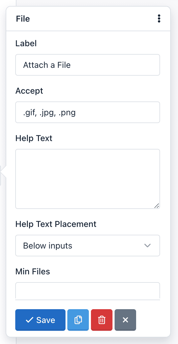
Accept: This option is in the File Upload field. With it you can limit the type of files the field can accept. You should consider the following:
- You must add the file extensions starting from the dot and separated by commas.
- By default, all files will be validated and will only be accepted image files with extension ‘.gif, .jpg, .png’. For example, to accept text files, you can change this option to: ‘.doc, .docx, .txt’. If you want to accept all types of files, you must leave this blank.
- This option enables the ‘accept’ attribute from the HTML5 standard, so the field validation is performed both on the client side (browser) and server side.
Alias: The Alias option let you send WebHook notifications using the Field Alias instead of the Field Name. For example, we’ll be able to re-send POST data by using “name” or “age” instead of “text_0” or “number_0”.
As Button: The “As Button” option let you display Radio Button fields and Checkbox fields as Buttons.

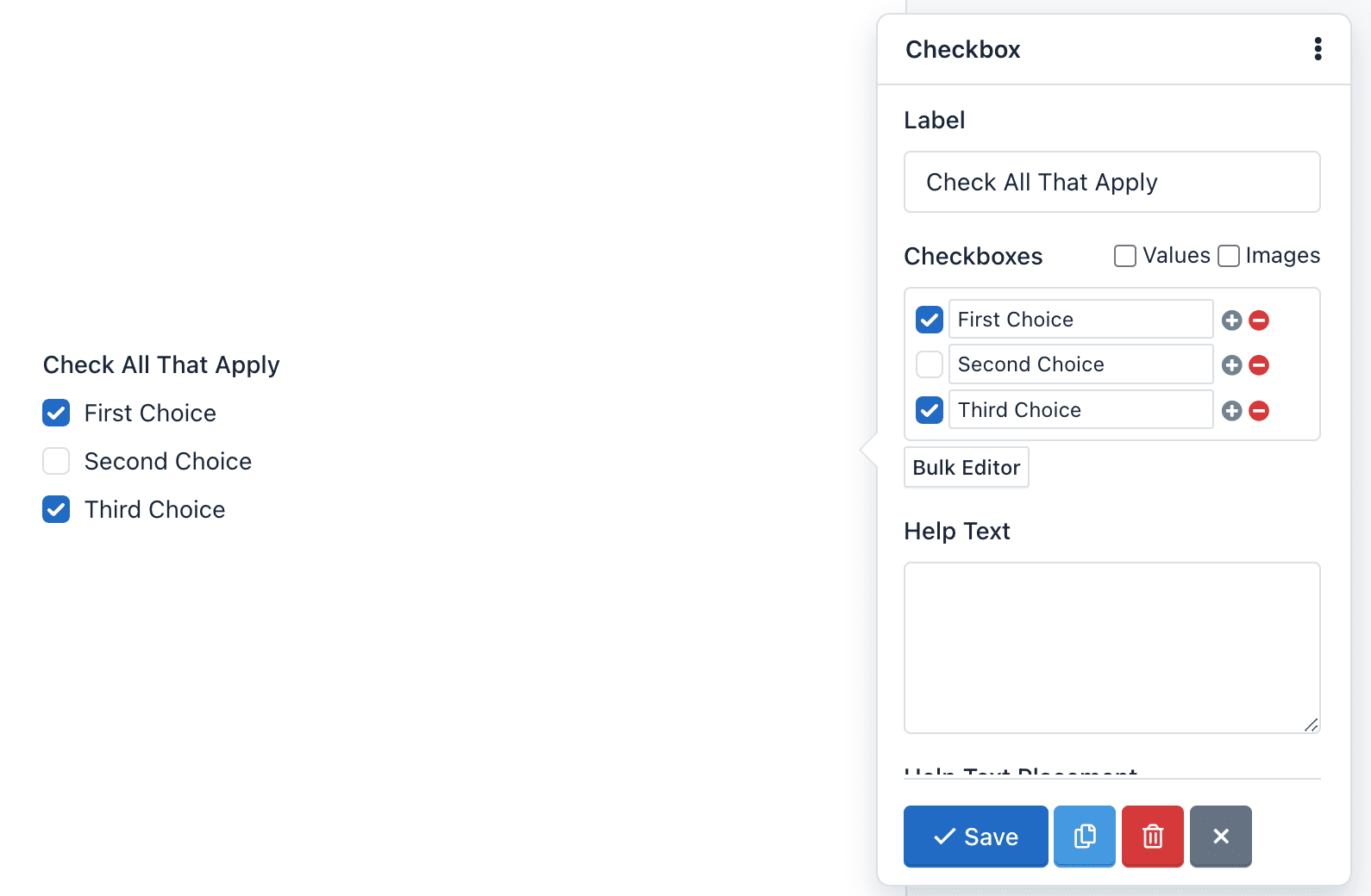
Checkboxes: The Checkboxes option is only available in Checkbox fields, and it’s used to add checkboxes to the component. For example, enter the Bulk editor and add the following “Checkboxes” and click “Save”:
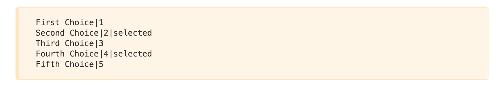
The form preview will show a Checkbox component with 5 checkboxes: First Choice, Second Choice, Third Choice, Fourth Choice and Fifth Choice. The “Second Choice” and “Fourth Choice” checkboxes will be checked. And finally, if the user submits the form without making any changes, he will be sending the values: 2,4.
Check DNS: This option tells the application that in the process of Email Field validation verify that the email domain really exists and has ‘A’ and ‘MX’ records.
⚠️ Caution! This is an advanced option and should be used with caution. Verification may fail due to a problem with the DNS servers even when is a valid email. By default, it is disabled.
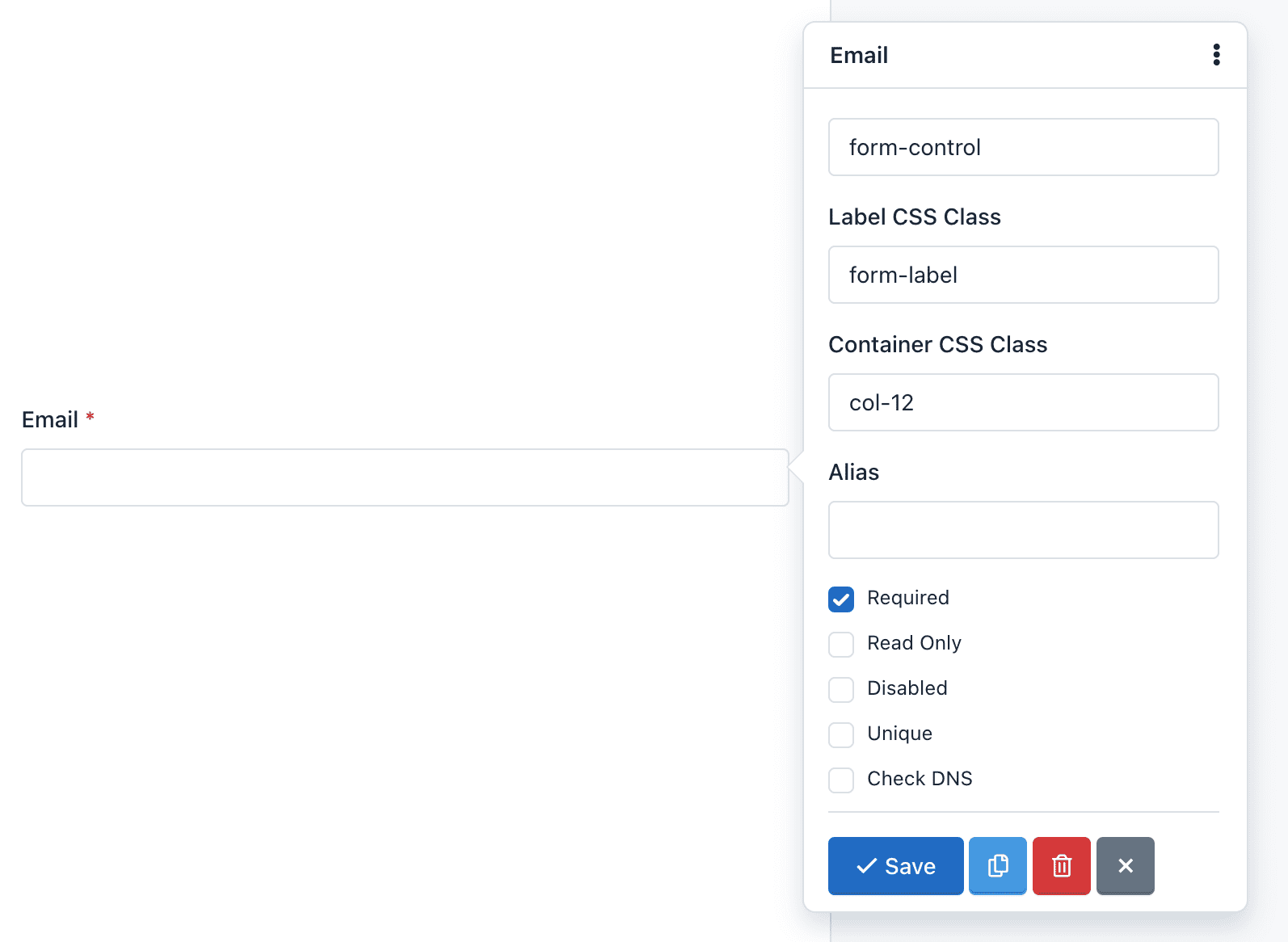
CSS Class: Lets you add one or more CSS classes to the Form Field.
Container CSS Class: Let you add one or more CSS classes to the container of the whole component. You can create multi-column forms by defining the class col-xs-* (the asterisk represents the number of columns, between 1 and 12). For example, if you want to place two fields in two columns you must do the following:
- Add the container CSS class to the first field: `col-xs-6
- Add the container CSS class to the second field: `col-xs-6
In this example, we are using the “no-padding” predefined CSS classes to remove the padding that Bootstrap CSS adds to the columns. You can add them or not according to your design. If not, you can add the container CSS class col-xs-12 to the rest of fields, to preserve the same padding on each field.
💡 PRO TIP: You can go to the Bootstrap CSS documentation for more information.
Note that by default, all fields except Button, come with the class: form-group. This class cannot be edited. Also, by default, the field Button comes with the class: form-action. This class cannot be edited either.
Custom Attributes: You can add custom attributes to a field. These attributes have two parts: The attribute name, and the attribute value. This feature allows you to create more accessible forms, specially because you can use it to add:
Data attributes: Useful to integrate form fields with javascript libraries
Aria attributes: Useful to describe form fields in a better way and offer more accessibility.
Default Value: You can add a default value to a field. This value appears by default, but the user can modify. If the user submits the form without having modified the default value, this value will be collected to process the submission.
Disabled: You can disable a field if you want it to be displayed to the user, but not be edited. (Note that you can also disable a hidden field). Unlike the Read Only option, a disabled field is not sent to the server. That is, the information stored in a disabled field is not received and therefore not appear on the Submissions Manager.
Field Size: A Text Area field allows its size configuration. The size must be an integer and indicates the number of rows displayed or, in other words, the field height. By default is 3.
Help Text: The text you type here will appear below the field and is often used to give the users instructions on what to put in it.
Help Text Placement: This Drop Down menu allows you to move the Help Text above or below the form field.
Inline: The Inline option is in the Checkbox fields and Radio Buttons and is used to change the vertical position of the checkboxes or radio buttons for a horizontal position.
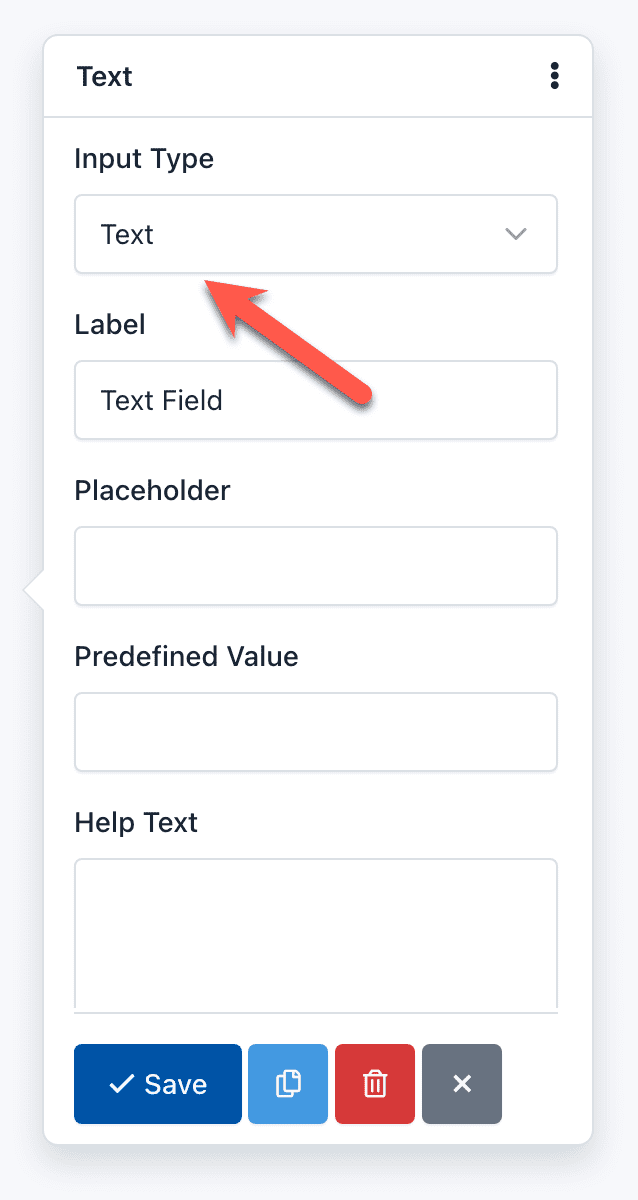
Input Type: Many fields allow you to change the Input Type to specify the type of data you will receive. For example, a Text Field can have an Input Type “URL”, to ensure that the text you type here is an absolute URL that starts with the letters ‘http’.
Integer Only: You can activate this option if you want the value of this field to be only an integer. If the user enters a floating point number, the Form would not be processed and instead a validation error appears.
Integer Pattern: It is an advanced option of the Number Field that allows you to customize the regular expression that accepts only integer numbers (0-9) and will be used in the Form Validation process. The regular expression used by default is ‘/^\s[+-]?\d+\s$/’;
Label: It is the most common way to inform the user the value he must enter in the field. Generally it is shown at the top of the field, but you can modify this position by changing the form layout.
Label CSS Class: Lets you add one or more CSS classes to the label. Keep in mind that if you want to hide a label, you can add the Bootstrap 3 css class ‘sr-only’. By default all fields come with the CSS class: control-label. It is recommended not to remove it.
Min date: You can define a date as the minimum date to be taken into account in the validating field process. If the user enters a earlier date, the form will not be sent and instead, a validation error will appear. If this option is not defined, this limitation will not exist.
The date must keep the following format: yyyy-mm-dd (HTML5 standard format) for static dates. Also, you can use tags to validate relative dates:
- {today}: Today is the minimum date.
- {today:+1}: Tomorrow is the minimum date.
- {today:-1}: Yesterday is the minimum date.
Max date: You can define a date as the maximum date to be taken into account in the validating field process. If the user enters an later date, the form will not be sent and instead, a validation error will appear. If this option is not defined, this limitation will not exist.
The date must keep the following format: yyyy-mm-dd (HTML5 standard format) for static dates. Also, you can use tags to validate relative dates:
- {today}: Today is the maximum date.
- {today:+1}: Tomorrow is the maximum date.
- {today:-1}: Yesterday is the maximum date.
Min number: You can define an integer or floating-point number as the minimum number to be taken into account in the validating field process. If the user enters a lower number, the form will not be sent and instead, a validation error will appear. If this option is not defined, this limitation will not exist.
Max number: You can define an integer or floating-point number as the maximum number to be taken into account in the validating field process. If the user enters a larger number, the form will not be sent and instead, a validation error will appear. If this option is not defined, this limitation will not exist.
Min Size: You can define an integer number as the minimum size to be taken into account in the process of validating the field. If the user uploads a file with a smaller size than the one you have defined, the form will not be sent and, instead, a validation error appears. If this option is not defined, this limitation will not exist.
The integer number represents the number of bytes allowed. For example, Min Size: 10311680 (resulting from the multiplication of 1024 x 1024 x 5), the minimum file size should be 5MB.
Max Size: You can define an integer number as the maximum size that will be taken into account in the process of validating the field. If the user uploads a file with a size larger than the one you defined, the form will not be sent and instead, a validation error appears. If this option is not defined, this limitation will not exist.
The integer number represents the number of bytes allowed. For example, Max Size: 10311680 (resulting from the multiplication of 1024 x 1024 x 5), the maximum file size should be 5MB.
Min length: You can define an integer number as the minimum length of the input string. If not set, it means no minimum length limit.
Max length: You can define an integer number as the maximum length of the input string. If not set, it means no maximum length limit.
Min files: You can define an integer number as the minimum number of files that the end user must upload to pass the validation.
Max files: You can define an integer number as the maximum number of files that the end user must upload to pass the validation. Use this feature to allow multiple uploads with the same File field.
Max length: You can define an integer number as the maximum number of files that the end user must upload to pass the validation.
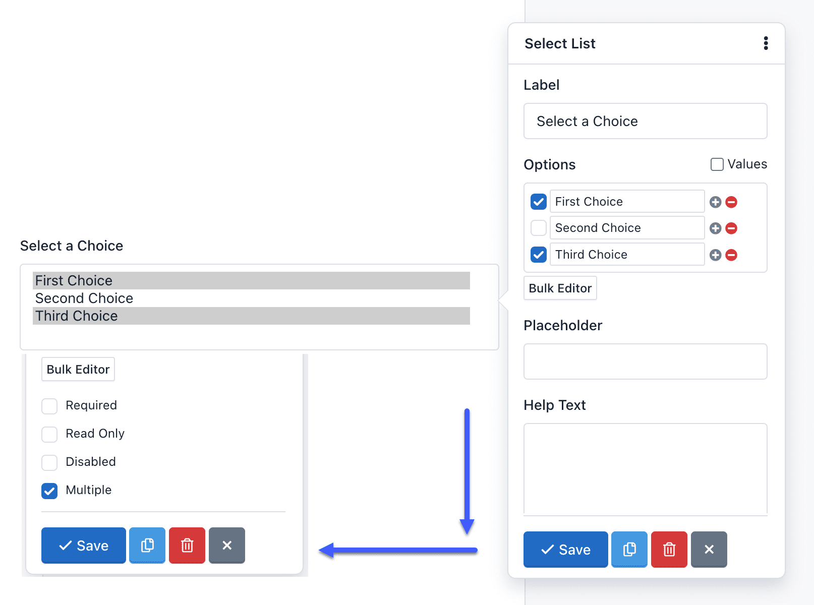
Multiple: This option indicates that the user can enter multiple values. You can find this option in the Email and Select List fields:
- If Multiple option has been enabled on an Email field, you can add several valid email addresses separated by commas. For example: ‘name@example.com,name2@example.com’.
- If Multiple option has been enabled on a Select List field, you can select several options. The collected information will have a comma-separated format. For example: ‘Option One, Option Two’.
Number Pattern: Is an advanced option of the Number Field that allows you to customize the regular expression that accepts any number and will be used in the Form Validation process. The regular expression used by default match with a floating point number and optionally an exponent part (eg -1.23e-10): ‘/^\s[-+]?[0-9].?[0-9]+([eE][-+]?[0-9]+)?\s*$/’.
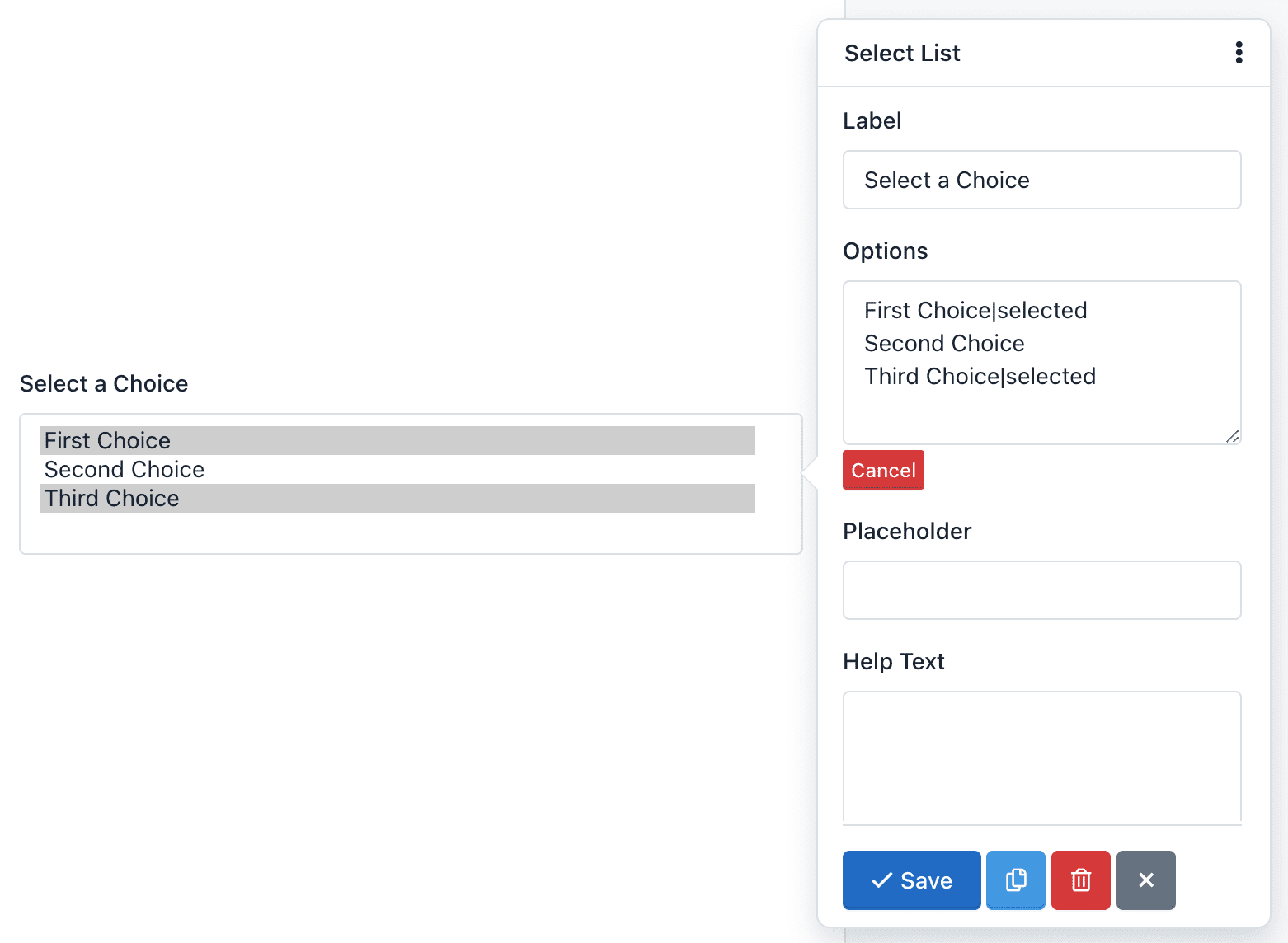
Options: The Options option is only in the Select List fields and are used to add selection options to the component. For example, if you enter in the Options field of the pop-up Form:
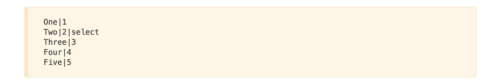
The Form Preview will show a box with the text “Two”. And if the user submits the form without making any changes, he will be sending the value: 2.
Pattern: It is an advanced option and allows you to add a regular expression to the field to be used in the Form Validation process. If the value sent by the user does not match this pattern, the form will not be processed and instead a validation error appears.
Placeholder: It is the alternative way of describing the value that the user must enter in the field. By default, the placeholder appears in the field until the user start to enter data.
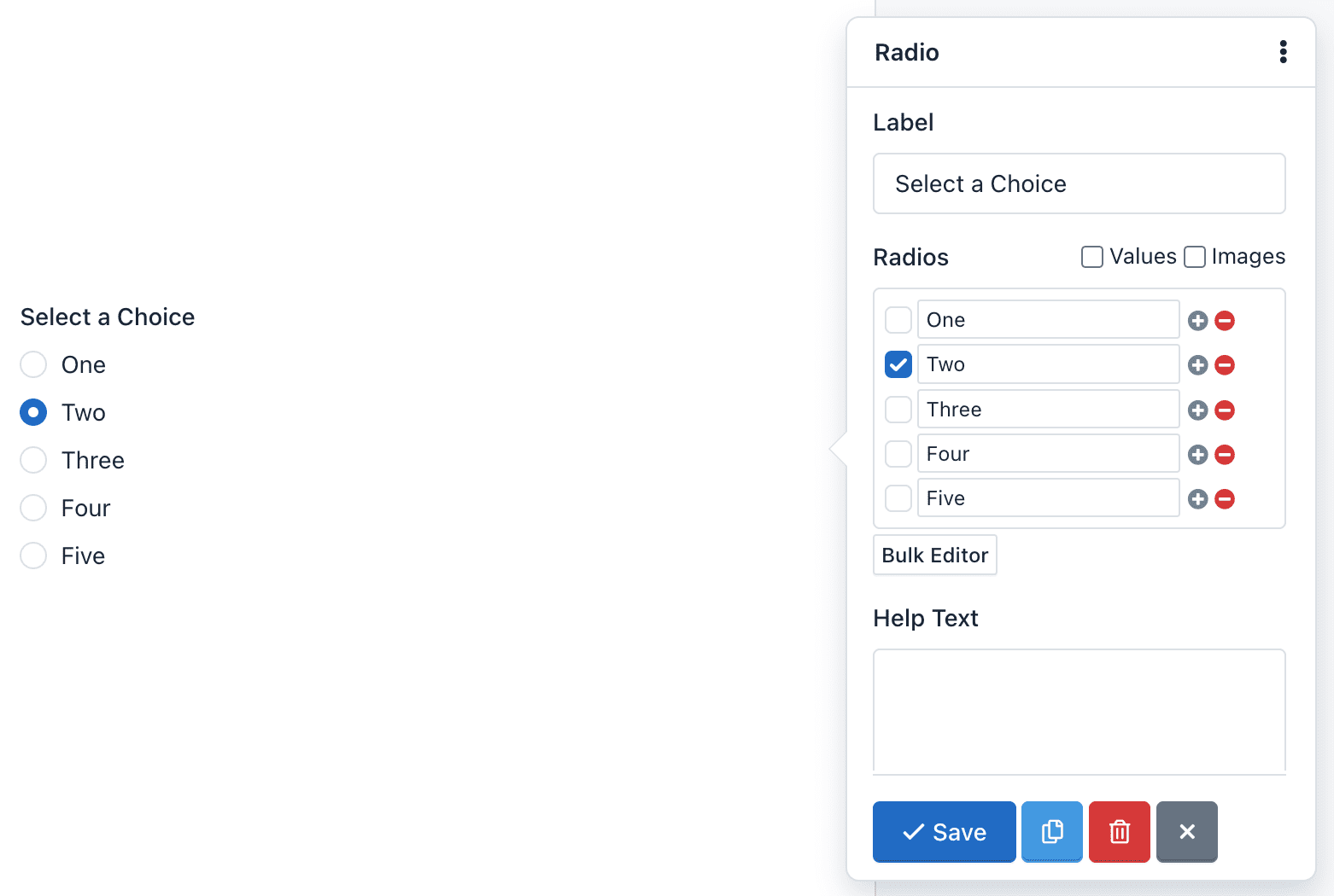
Radios: The Radios option is available in Radio Button components, and it’s used to add radio buttons to the form. For example, if you click Bulk Editor and enter the following radios:
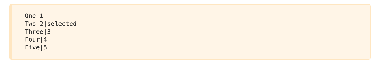
The Form Preview will show five radio buttons with the words: One, Two, Three, Four and Five. The option Two will be selected. Then, if the user submits the form without making any changes, he will be sending the value: 2
Read Only: When you enable this option, the field will be displayed to the user but he cannot edit. The information in a Read Only field is received and validated by the server when the Form is submitted. It will also be collected by the Submission Manager.
Required: This property allows you to ensure that the user complete a specific field before sending the form. If the user submits the form with an empty required field, the form is not processed and instead an error message is displayed. By default, the required fields labels have a red asterisk on the right.
Step number: With this option, you can set the HTML5 ‘step’ attribute of the Number and Date fields. The ‘step’ attribute specifies the valid number to be use as an interval when changing the values of this field using the browser controllers. Modern browsers recognize this attribute.
Important: If the Number field has the ‘Integer Only’ option enabled is recommended to set your ‘Step number’ to 1.
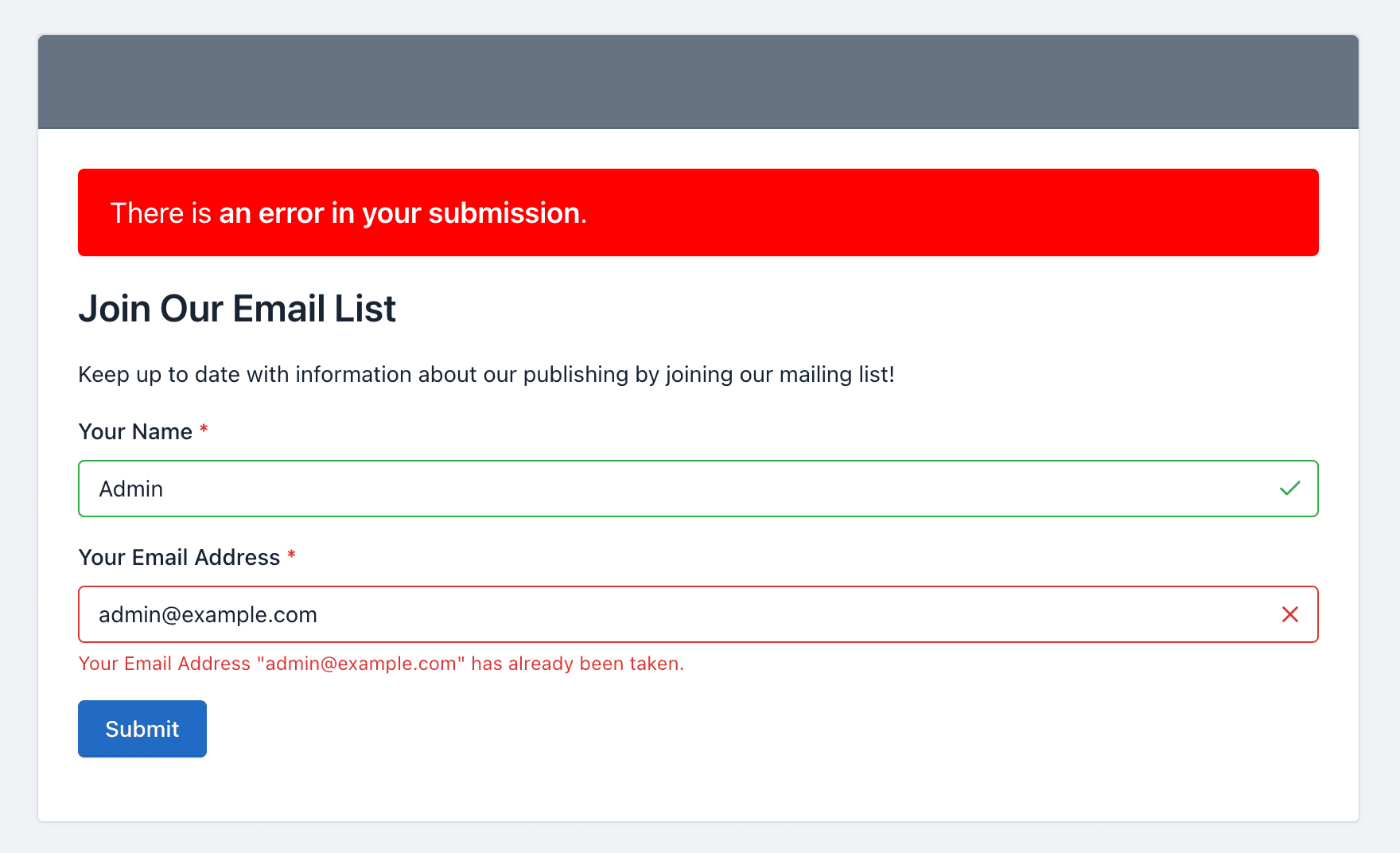
Unique: This option allows you to check that the information entered into this field is unique and has not been submitted previously. Useful for mailing lists and registration forms, where preventing the users from entering the same information more than once is often needed.
If you have additional doubts, the documentation about Field Types might help you.
