The Form Builder is a key piece in QuickForms. It’s where forms are created and updated. The Form Builder provides the necessary tools for add and remove fields as other HTML elements. Let’s explore each one of its elements.
First Screen
The Form Builder interface is divided into three areas: On the left the form fields, on the right the theme designer and in the center the form preview.
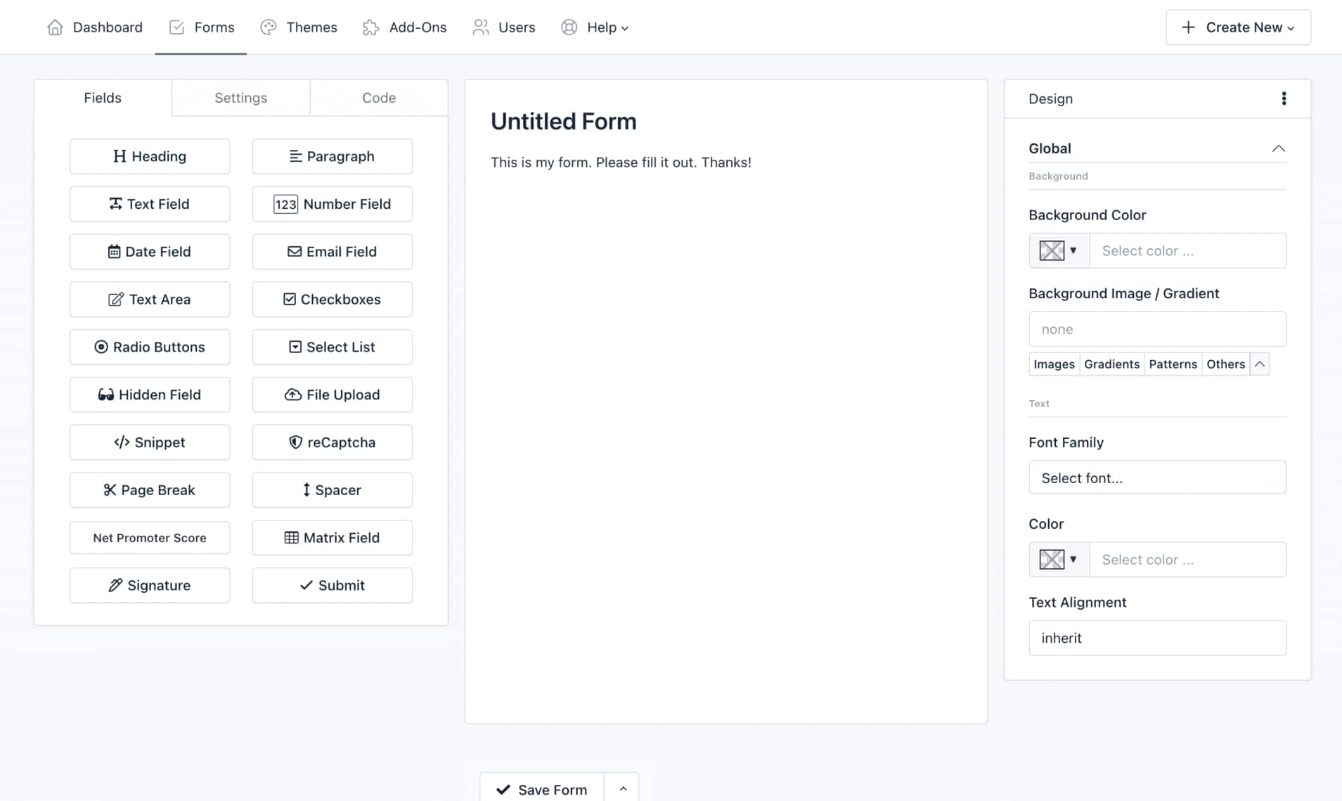
The left panel has three tabs:
- The tab Fields displays all fields and elements that can be added to the form. Simply drag and drop them to the right area.
- The tab Settings lets you set the form name, the form layout (labels position) and disabling all fields.
- The tab Code allows you to see in real time the HTML code that is being generated with the Form Builder. From here you can recognize each element ID to manipulate the Form in a more advanced way. A “Copy” button allows you to copy the entire source code easily.
The center area is the Form Preview from where you can manipulate each of the components.
The right panel is the Theme Designer from where you can customize the look and feel of your form:
- Backgrounds: Change the background of different elements on your form.
- Typography: Choose the font, style, size, and color of all the text elements on your form.
- Borders: Set the thickness, style, and color of the borders around certain elements on your form.
- Shadows: Add or remove a drop shadow around your form.
- Buttons: Change the text of the Submit button.
- And much more!
Add a field
There are two ways to add a field:
1.- Clicking a widget on the left panel. That’s all! The form component will appear in your form, below all other components.
2.- Adding a field in a specific placement:
-
- Click a widget on the left panel and Drag it to the right area.
- At the time you enter the Form Builder’s active area, a box will indicate where will be placed the Field.
- Once you placed it where you need, drop the button.
Edit a field
1.- Click on the field to edit, and a pop-over will appear with field information
2.- Edit the information according to your requirements.
3.- Click Save.
Reorder the fields
To reorder a field (component):
1.- Click on a component and hold
2.- Drag the component up or down according to your requirements.
3.- According to where you drag the component, an active zone where the component will be placed will appear.
4.- Once placed in the required place, release the component.
Drag fields to create columns
To create columns with a field (component):
1.- Click a widget on the left panel and Drag it to the form builder canvas.
2.- Drag it to the left or right of an existing field.
3.- A border will indicate where will be placed the field.
4.- Once you placed it where you need, drop the widget.
Within the form builder, you can drag existing fields into the “column drop zone” – the builder will then automatically resize all fields within the drop zone to create columns of equal width.
You can create until four columns with this method. However, you can design forms with/until 12 columns that fit perfectly with the space available on your website by using the Container Css Class feature.
Copy a field
To copy a field (component):
1.- Click on a component and hold.
2.- Click the ‘Copy’ button in the Popover window
You’ll notice that the copied field will appear below the original field.
Delete a field
To delete a field (component):
1.- Click on a component and hold.
2.- Drag it out of the active zone.
3.- Release.
You’ll notice that the component has disappeared.
Copy Field ID
To copy the Field ID follow these steps:
1.- Click on a component and hold.
2.- Click the 3 vertical dots (in the Popover heading)
3.- Click Copy ID.
Now you can paste it in other place like a custom email message or a CSS design.
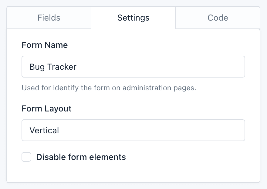
Basic Form Settings
By clicking on the Form Builder’s Settings tab, you will access a very basic version of the form configuration. From here you can:
Change the form name: The form name is to recognize the Form in the administration pages and is also display as the Form public page title at QuickForms.
Change the form layout: The form layout is based on Bootstrap CSS and is used to locate the labels position on the form.
-
- The Vertical layout displays the field labels above,
- The Horizontal layout displays the labels on the field left side, and
- The Inline layout hides the labels and displays the fields next to each other. For example, you can use it on a mail registration form, to place an Email field and a button by the side.
Disable form elements: Lets you disable all form fields. It is an advanced option that can be useful if you plan to interact with the form from an external javascript file.
With these information, you have the basics to use the Form Builder. Check our documentation for more information on field types and field settings that can be found on these screens.
