These are some field types you can find on QuickForms.
Heading: Headings are used to mark Form sections, also as to give it a title. For example, when you enter the Form Builder to create one, you will see a heading (h3) with the text “Untitled Form”. To modify this text, just click on it. Immediately a form will appear with all the options to customize it.
Paragraph: Paragraphs are components used for fleshing out a form. For example, you can use them to invite your users to fill out the form or to give directions. When you enter to the Forms Builder to create one, you will see a paragraph with the text “This is my form. Please fill it out. Thanks!” To modify this text, simply click on it. Immediately a form will appear with all the options to customize it.
Text Field: A text field is a component that allows you to write only one line of text. Web browsers consider the text field as the standard default field from others more specialized such as URL or color. The text field can have five different input types, each of which is used to validate data differently. The five types are:
- Text: This is the default type for this component. And it is one that is commonly used in forms, because it does not offer any validation and will accept all data sent by the user. If the browser does not recognize any other type, such field will be displayed instead.
- Url: This type was introduced by HTML5 and now modern browsers accept it. Use the URL type if you want to collect absolute URLs that starts with ‘http’.
- Color: This type was introduced by HTML5 and modern browsers that accept it, displays an automatically color palette when you click on it. Use the Color type if you want the collected data to be the hexadecimal value of a color, starting with a ‘#’ sign. For example, ‘#FFFFFF’.
- Tel: This type was introduced by HTML5 and now modern browsers accept it. Use this type if the data to collect is a phone number.
- Password: All browsers recognize this type of entry. Use this entry type if you want the user to enter data not shown on screen. Note that Easy Forms is not meant to store passwords, mainly because the data is stored as plain text. If required, use this input type with caution.
Number Field: A number field is a component used to collect numbers as content. Following the HTML5 standard, this component can be of 2 types:
- Number: This is the type that should be used when you want the user to type the number. For example, you may ask: “How old are you?” If the user enters ‘Five years’, they are notified that they must write only numbers: 5, in this case.
- Range: This type of entry is also used to collect numerical data, but unlike Number, modern browsers display a slider the user can use to enter his data. For example, you can ask “From 1 to 10, how good are you at math?” Depending on how you drag the slider, the value will be higher or lower.
Unlike Text components, Number components offer many different validation options. For example, Integer Only indicate that the field must collect only numerical integers data: Decimals are not accepted! You can also set the minimum and maximum number to be entered and more. All these options follow the HTML5 standard and are also validated on the server.
Date Field: A date field is a component used to collect valid dates. Date fields were introduced by HTML5 and modern browsers that recognize them display a calendar by clicking on the field. This component can have 5 different types of input:
- Date: The input type to use if you want to collect dates. You must have the format: yyyy-mm-dd.
- DateTime-Local: The input type to use if you want to collect dates and times. The collected data will have the standard ISO format: yyyy-mm-ddThh:mm:ss.
- Time: The input type to use if you want to collect times in the format: hh:mm:ss.
- Month: This type of entry is supported by modern browsers and should be used if you want the user to select the month or month and year. The input format is yyyy-mm.
- Week: This type of entry is supported by modern browsers and should be used if you want the user to select the week of the year in numerical format.
Email Field: An email field is used to collect valid emails. By default it validates that the text contains a ‘@’ and ‘.’ plus two or more characters for the e-mail domain. In addition, you must use this field to send notifications that have your users mails as senders (Reply-To).
An advanced option of this field is the ability to verify the mail DNS to confirm that the domain really exists and has an A and MX record. Care should be taken that this validation can fail due to problems with the DNS servers even when mail is valid. By default, this option is disabled.
Text Area: A text area is a component that allows you to collect multiple lines of text, with multiples paragraphs. It is a suitable field if you want users to draft a comprehensive text. Also, you can change some settings. For example, you can change the height of the text area, to display more space to your users. To do this, click on the text area and change the size of the field that by default is 3.
Checkbox: The Checkbox component adds checkboxes to the form. This component provides an option list with a checkbox next, so your users can check all, some or none. You can use it if you want to get several answers, for example: Which of the followings are fruits?
To add, edit and delete checkboxes, you must click on the component. Then a form appears with the “Checkboxes” field. Note that each line of this field represents a different choice. Each choice can be composed of three parts: Label, Value and Image. Additionally, you can check them.
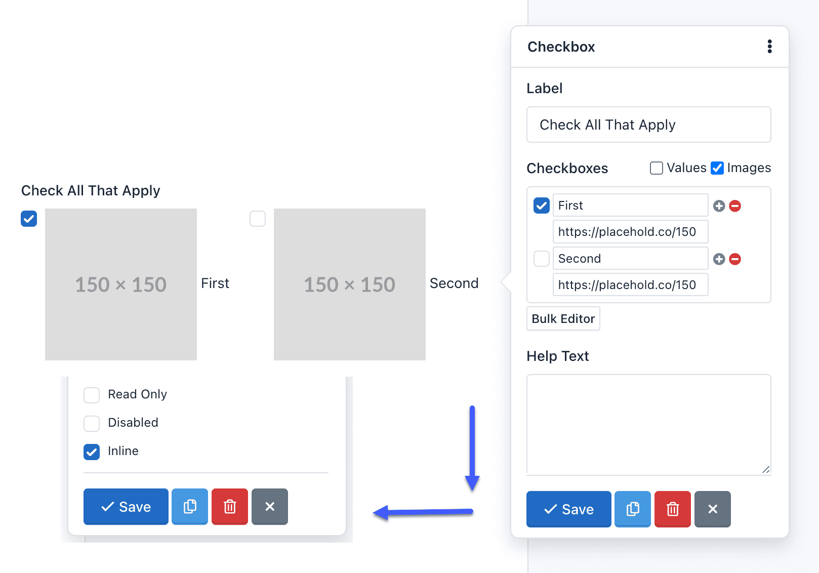
Also, you can choose the Bulk Editor tool to insert choices separated by a vertical bar or pipe line. The format should be as follows: Label|Value|selected. The second and third part of this format is optional.
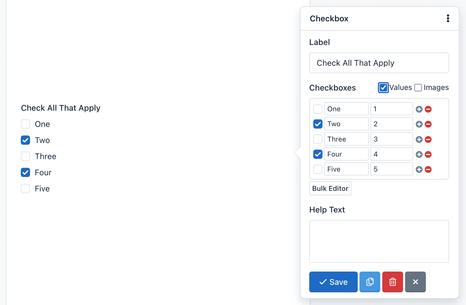
For example, click Bulk Editor and add the following “Checkboxes”:
One|1
Two|2|selected
Three|3
Four|4|selected
Five|5
The Form Preview will show 5 checkboxes with the words One, Two, Three, Four and Five. The “Two” and “Four” option will be selected. And, if the user submits the form without making any changes, it will be sending the values: 2,4.
We’ll be creating five checkboxes:
One: Creates a checkbox with the value: ‘One’ and the label: ‘One’Two|2: Creates a checkbox with the value: ‘2’ and the label: ‘Two’Three|3|selected: Creates a checkbox with the value: ‘3’, the label: ‘Three’ and will be checked by default.Four|4|http://example.com/image-4.jpg: Creates a checkbox with the value: ‘4’, the label: ‘Four’ and the image will appear next to the checkbox.Five|5|http://example.com/image-5.jpg|selected: Creates a checkbox with the value: ‘5’, the label: ‘Five’ and the image will appear next to the checkbox and will be checked by default.
To add icons instead of images, you should only replace the images URLs by the icons’ CSS classes. For example: glyphicon glyphicon-user, will display the user icon. Keep in mind that by default, the application has the Glyphicons Pro set of icons; however, you can use other icons like Font Awesome or DevIcons. For this, you just have to add the fonts to the CSS theme of your form.
Radio Button: Radio Button is a component that lets you add a group of radio buttons to the form. This component gives users a list of choices, but they must select only one of them. For example: What is your favorite color?
To add, edit and delete options, you must click on the component. Then a form appears with the “Radio” field. Note that each line of this field represents a different option. And each line can be composed of three parts, separated by a vertical bar or pipe line. The format should be as follows: Label|Value|select. The second and third part of this format is optional.
For example, if you enter in the field “Radio” of the pop-up Form:
One|1
Two|2|selected
Three|3
Four|4
Five|5
The Form Preview will show 5 check boxes with the words One, Two, Three, Four and Five. The “Two” option will be selected. And if the user submits the form without making any changes, it will be sending the value: 2.
Also, since version 1.3 you can add pictures or icons to the radio buttons to give a more dynamic touch to your forms.
To insert a picture on a radio button label you must add the image url as the third setting parameter of the radio button. For example, if we set up our component as:
One
Two|2
Three|3|selected
Four|4|http://example.com/image-4.jpg
Five|5|http://example.com/image-5.jpg|selected
We’ll be creating five radio buttons:
One: Creates a radio button with the value: ‘One’ and the label: ‘One’Two|2: Creates a radio button with the value: ‘2’ and the label: ‘Two’Three|3|selected: Creates a radio button with the value: ‘3’, the label: ‘Three’ and will be selected by default.Four|4|http://example.com/image-4.jpg: Creates a radio button with the value: ‘4’, the label: ‘Four’ and the image will appear next to the radio button.Five|5|http://example.com/image-5.jpg|selected: Creates a radio button with the value: ‘5’, the label: ‘Five’ and the image will appear next to the radio button and will be selected by default.
To add icons instead of images, you should only replace the images URLs by the icons’ CSS classes. For example: glyphicon glyphicon-user, will display the user icon. Keep in mind that by default, the application has the Glyphicons Pro set of icons; however, you can use other icons like Font Awesome or DevIcons. For this, you just have to add the fonts to the CSS theme of your form.
Select List: A Select List is a drop-down menu that allows the user to select one or several options, depending on the configuration you choose. The main difference with the Radio Button component is that you can add a lot of options without changing its size. So its use is recommended when there are plenty of options for example: Select your country of origin?
To add, edit and delete options, you must click on the component. Then a form appears with the “Options” field. Note that each line of this field represents a different option. And each line can be composed of three parts, separated by a vertical bar or pipe line. The format should be as follows: Label|Value|selected. The second and third part of this format is optional.
For example, add the following “Options”:
One|1
Two|2|selected
Three|3
Four|4
Five|5
The Form Preview will show a box with the text “Two” and if the user submits the form without making any changes, it will send the value of 2.
Select List with option groups: To create an option group <optgroup>, enclose the text with double square brackets, for example:
[[Swedish Cars]]
Volvo
Saab
[[German Cars]]
Mercedes
Audi
Hidden Field: By adding a hidden field to the form, this will not be shown on the form. However, hidden fields are useful for mathematical calculations or send default values without changing the form interface.
File Upload: The File Upload field is a component that enables users to attach files in the form submission. Once sent, the files will appear in the detailed submission information. There are two details that must take into account:
- Allowed file types: You can limit the types of files that can be uploaded in each file field. By default, allowed file types for picture are: ‘.gif, .jpg, .png’. To modify the allowed file type, you must click on the component and on the ‘Accept’ form field that appears, change file extensions allowed, eg, ‘.doc, .pdf, .txt’ to accept text files.
- Size limitations: You can limit the file size as define a minimum or maximum size for each field. To modify the allowed file size, click the component and then expand the pop-up form by clicking on the ‘More’ link. Then locate the Minimum and Maximum Size fields and enter the digit that represents the number of bytes allowed. For example, Max Size: 10311680 (resulting from the multiplication of 1024 x 1024 x 5 = 5MB).
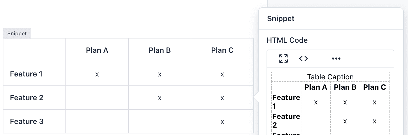
Snippet: The HTML Snippet field is an advanced use component that allows you to add HTML code to your forms. It will display a Wysiwyg editor able to recognize keyboard shortcuts to style your HTML code quickly.
Be careful of entering a valid HTML code, otherwise, the Form Builder won’t save the form and, it will display an error message indicating the line of code where the error was made. For example, a common mistake is to add more of one HTML element with the same ID.
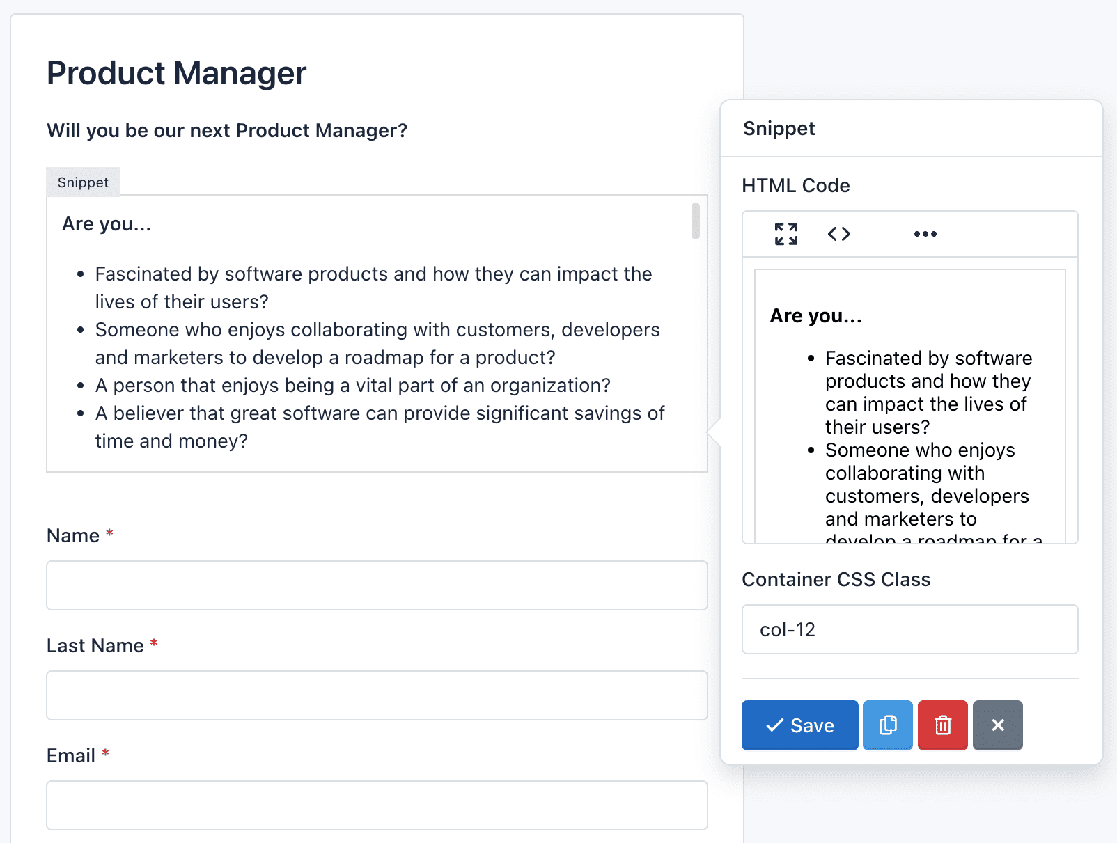
To add an HTML table, enter a link or display an image, first, you will need to click the Fullscreen button. This will open the Wysiwyg editor over the Form Builder, so you will get more space to enter all the needed content. Also, you can click the Code button to display the content as HTML code.
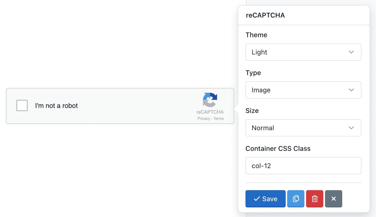
reCaptcha: The reCaptcha field is an advanced component that allows you to use Google technology to verify that users are not bots and/or spammers. You can modify the reCAPTCHA configuration, like changing the theme color, type of captcha and size. A detail to keep in mind is that you can only add a reCaptcha component per Form.
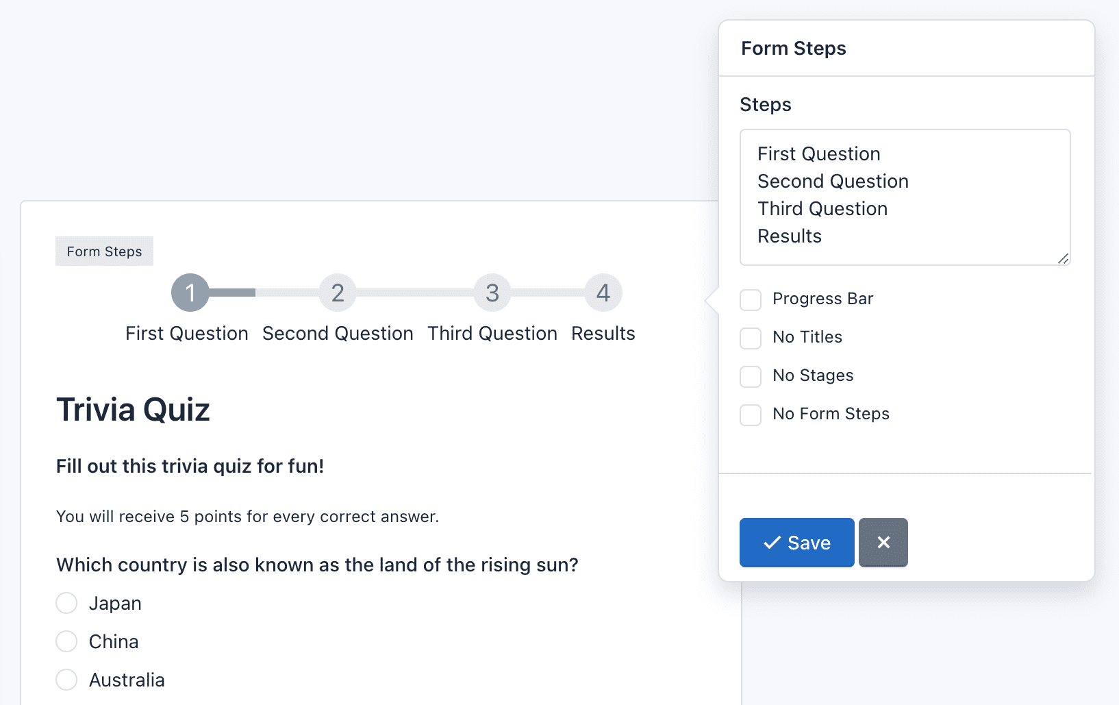
Page Break: The Page break field is an advanced component that allows you to create multi-step or multi-page forms. For each page break created you will add a new page. In addition, a header will be displayed above the form to let users know in which step they are and how many steps must follow to submit the form. There are two details that must take into account:
- The Page Break component adds two buttons to allow Form Navigation. You can customize the text on the button ‘Next’ or ‘Previous’ by clicking on the component.
- Form Steps: Appear above the form. Settings:
- Click Form Steps to check its settings. You can change the titles of each step in the field Form Steps. Each line matches a title.
- You can specify to display only the titles or steps (numbers).
- You can change the step numbers by glyphicons icons. To use Glyphicons in stages, you should add to each line of the Steps fields, a vertical bar or pipe line followed by ‘icon-[name of icon]’. For example, if I want to replace the number 1, I write it in the first line of Steps: ‘Untitled Step|icon-user’. Go to Glyphicons to view the name of the icons you can use.
- You can change the design of the steps for a progress bar indicating the percentage that has been achieved.
- Finally, you can hide the Form Steps by checking the ‘No Form Steps’ option.
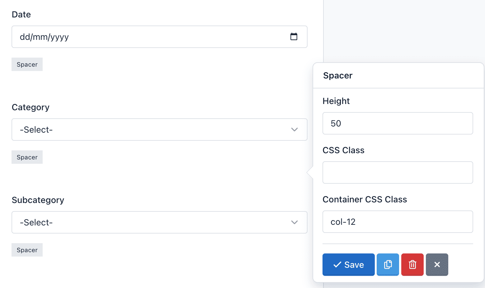
Spacer: The Spacer component allows you to add precise vertical spacing between fields on your forms. Just drag and drop a Spacer between your fields and set the number of pixels between they.
Options:
- Height: Is the space defined by the number of pixels.
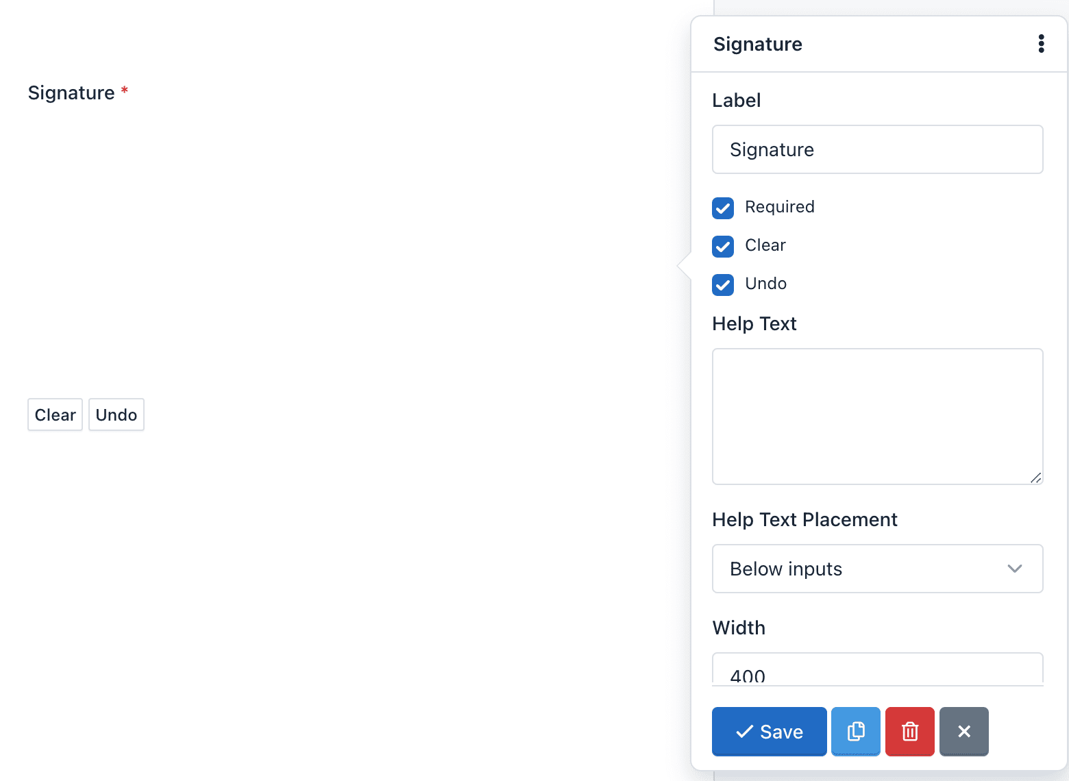
Signature: The Signature component allow your end users to sign your form – either with their mouse or finger on an iPad/smartphone – their John Hancock directly onto the form. So, you can securely capture signatures for contracts, legal documents, and other forms in which you need a physical autograph.
There are two details that must take into account:
- The Signature component adds two buttons to allow Canvas Interactions. You can customize the text on the ‘Clean’ and ‘Undo’ buttons by clicking on the component.
- Field Settings: The Signature field has the following special options:
- Clear: Enable / Disable the “Clear” button. When an end user clicks the “Clear” button, the signature will be removed. And the canvas will be clean to start again.
- Undo: Enable / Disable the “Undo” button. When an end user clicks the “Undo” button, the last stroke of his signature will be removed. He can continue pressing this button to undo his signature step by step.
- Additionally, you can define the width and height of the canvas, the color of the pencil, as well as change the text of the buttons between other common settings.
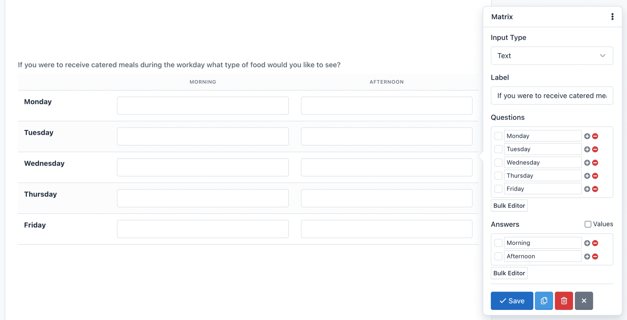
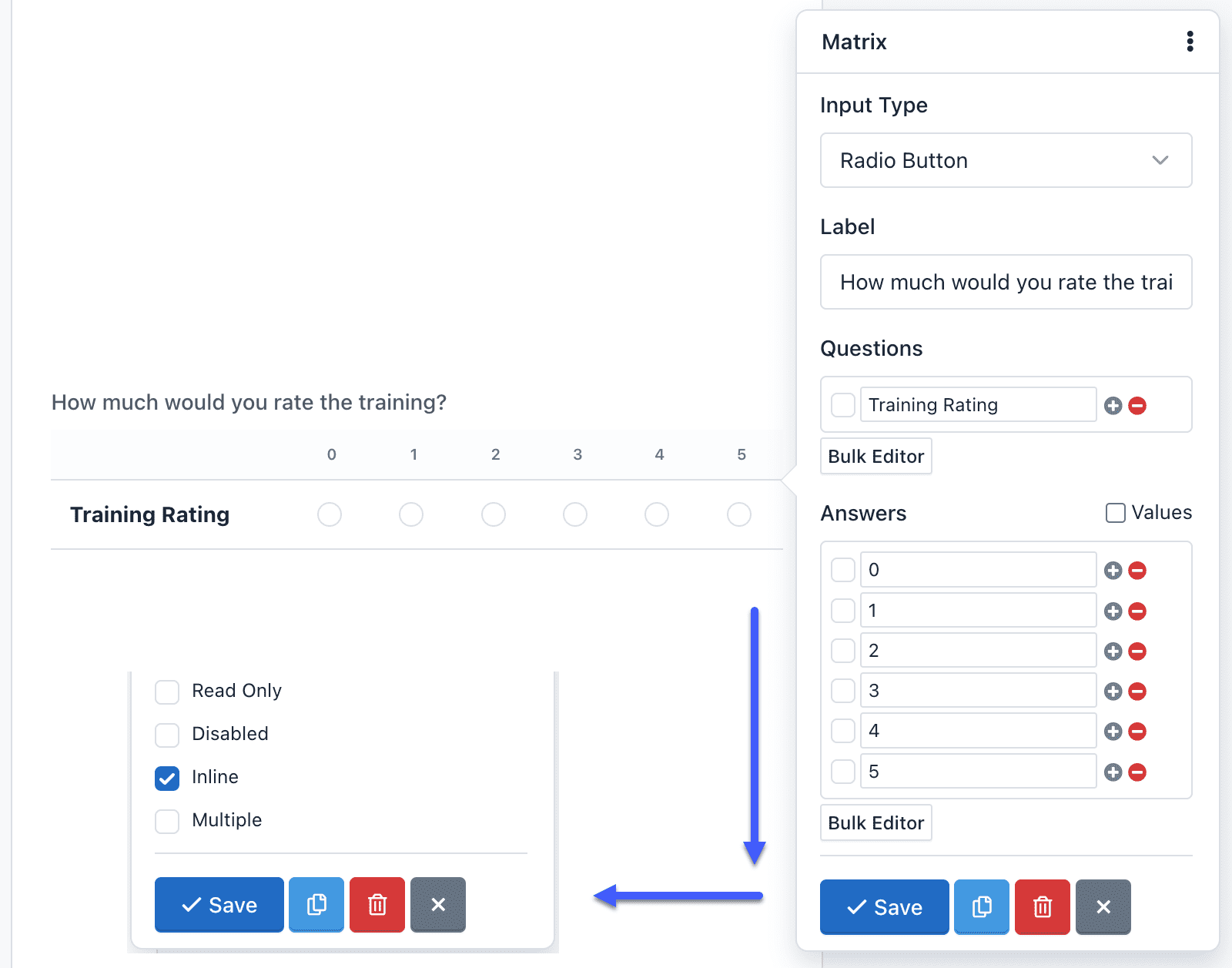
Matrix Field: The Matrix field is an advanced component, allows you to group multiple form controls with the same input type within a table. You can create a matrix field with the following input types:
- Radio Button (By Default)
- Checkbox
- Select List
- Text
- Text Area
- Number
- Range (Slider)
- Tel (Phone)
- URL
- Color
- Password
- Date
- DateTime-Local
- Time
- Month
- Week
All the form controls are fully customizable and according to its type, the correct input validation will be applied.
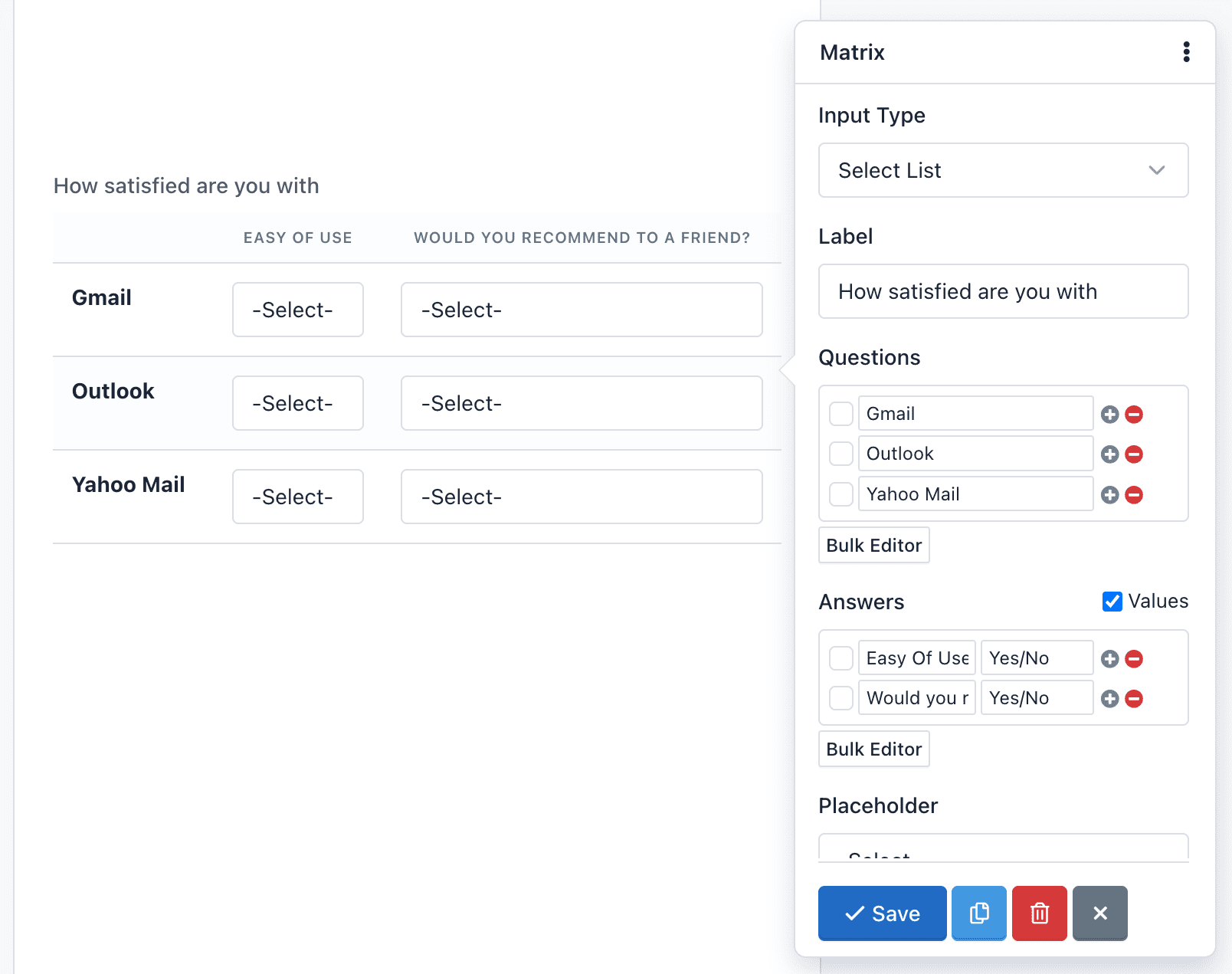
You are able to make open questions too, with the Text Input variation, each row contains a set of text entry boxes. This variation looks and acts similar to the Text Field. The same applies for other input fields based on text, like a text area or number fields.
A special feature in the Matrix field is the ability to hide the questions. Just check the “Inline” option and questions will disappear. You can use this feature if you only want to do a single question in a tabular format.
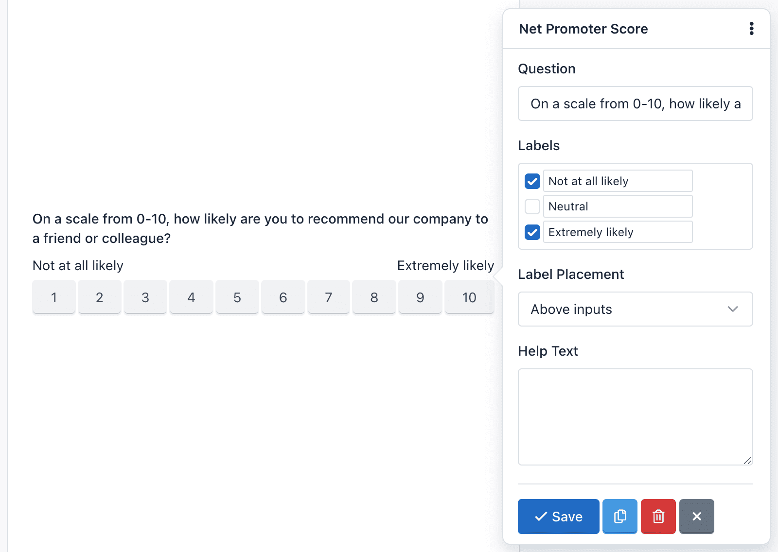
Net Promoter Score (NPS): NPS is probably the most important customer satisfaction and customer loyalty metric to track and now it’s available in Easy Forms.
QuickForms
NPS helps you collect authentic customer feedback, so you really understand how your organization is performing. It’s a way of recording what your customers think, their satisfaction levels, and whether they’d recommend you.
Ask them things like:
“On a scale of 1–10, how likely are you to recommend us to your friends?”
This gives you qualitative insight into ‘why’ your customers feel that way, which tends to work better than those generic annual customer satisfaction surveys.
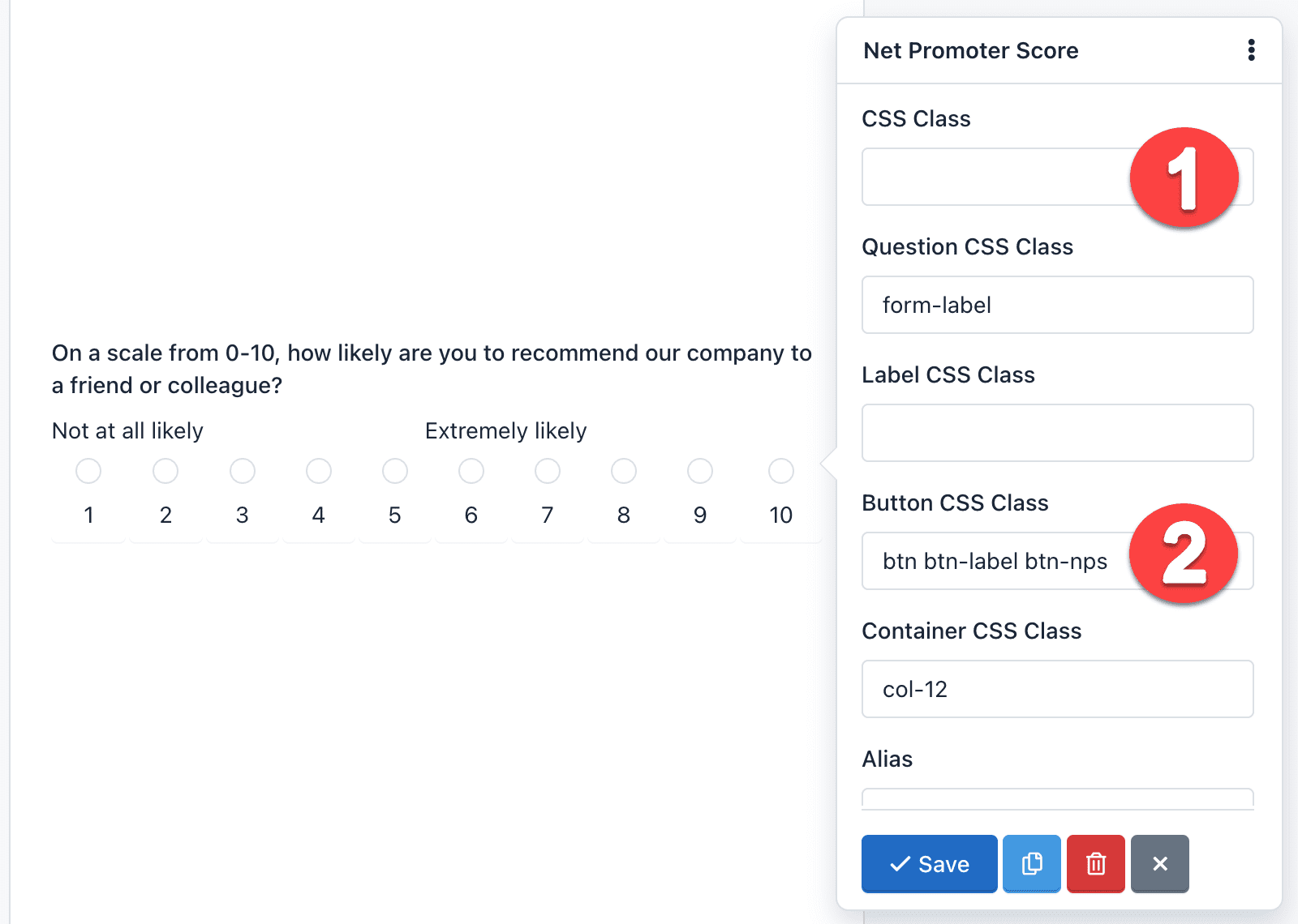
This component allows you to customize the question, show labels, help text and more. Also, it can be displayed as buttons or as radio buttons. By default, the design shows buttons. Just remove the CSS Class: hidden and replace the Button Css Class with: btn btn-label btn-nps.
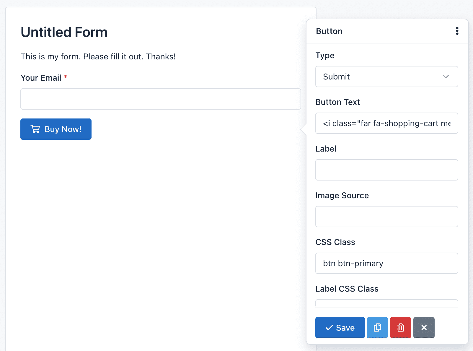
Button: The button field is a component that allows you to send the forms. While it is normal to add one button per form, nothing prevents you to add more, for example at the beginning and end of the form. This component can be of 3 types:
- Submit: To submit the form. It is selected by default.
- Reset: To reset the form to their default values.
- Image: Displays an image on the button and like Submit is used to submit the form. If you use this type of button you need to add the URL of the image and also remove the CSS class.
- Button: This type doesn’t send the form, but it can be used to interact with the fields via javascript.
You can add an icon to the buttons type ‘Submit’, ‘Reset’ and ‘Button’, writing in the attribute ‘Button Text’ the icon label. For example:
<span class="glyphicon glyphicon-shopping-cart"></span> Buy Now!
It will display your button with a nice icon at the beginning:
Validate your Field
A very important point to consider is the field validation that runs when users submit a form.
Field validation is the process by which it is verified that the data submitted by users meet certain requirements. For example, a Date Field requires that the value sent to the server has the following format yyyy-mm-dd. Validation ensures that this happens.
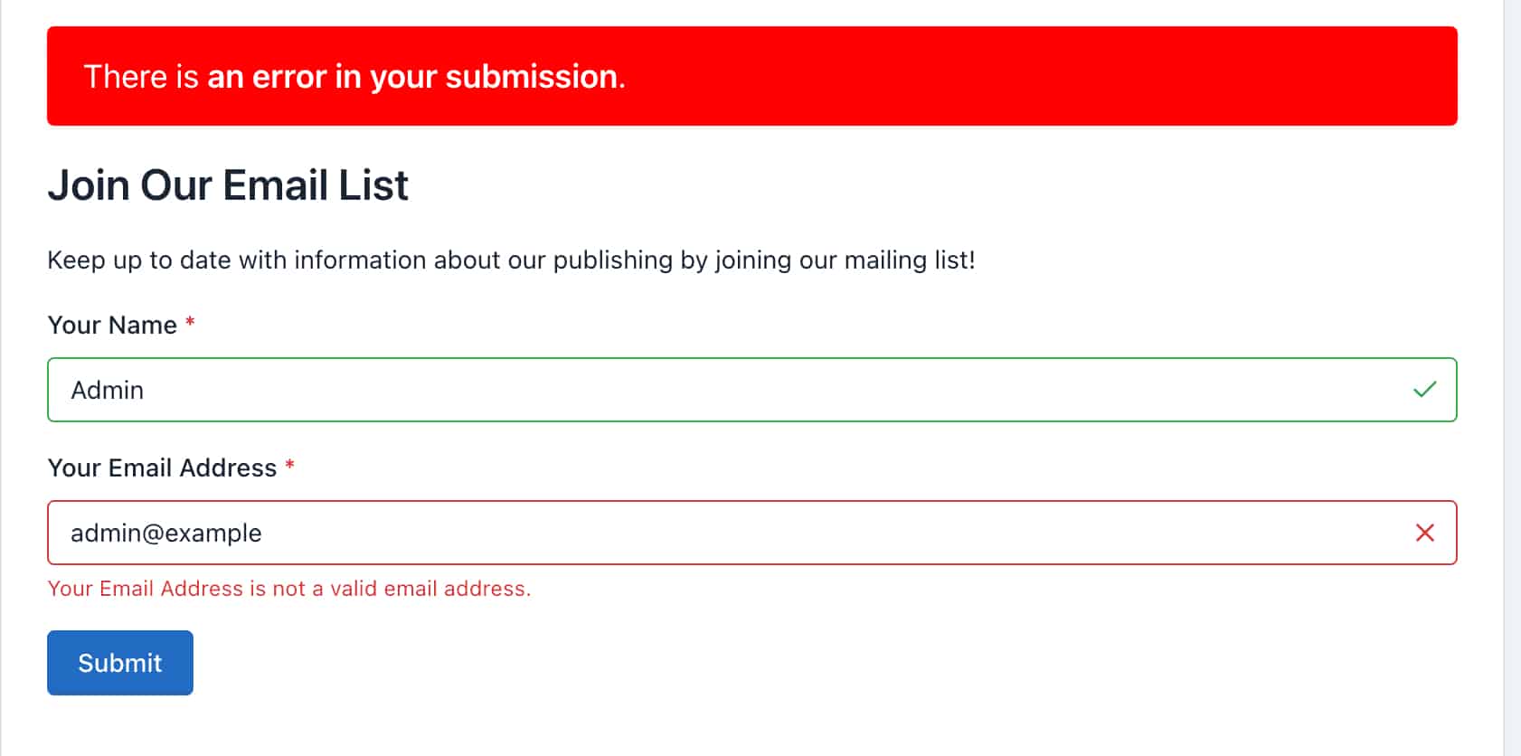
You should note that QuickForms works with standard HTML5 fields, so you can always go to HTML5 documentation for more information. In addition to validation by type, fields may have other requirements, such as ‘Required’ and ‘Unique’.